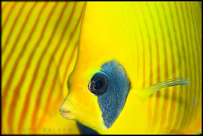
I think it is a beautiful image with great color, and the butterflyfish 'background' makes it an abstract that isn't.
I don't think it's missing anything. Maybe try increasing the contrast just a little.
I'd have to agree. Lovely shot that's perfectly exposed, composed and is as crisp as can be. But as I've noticed with some of the better photographers on here, they're never quite satisfied which is probably what keeps them a cut above the rest.
I agree .. very nice ... I love the colours and lines.
I would echo a little more contrast and shadows .. make the image a touch darker .. for my eyes at the size.
I have trouble getting a butterfly fish to stay around to get its photo taken let alone two that close.
I like it as it is. But what I think you fell it lacks is shadows and the depth and three dimensionality that they would give it. Alex
Suzy,
One thing you may want to try that I have recommended before on this forum is Local Contrast Enhancement in Photoshop. One of the ways to do this is as follows:
Before you do your final sharpening step try this.
Duplicate your background layer and then run an Unsharp Mask Filter on that layer with the Radius at 80 and the percentage at 15%. Toggle the preview button on and off and you will see the image pop a little. You can play with the sliders a little to your taste. Maybe that will help separate the front fish a little from the background fish.
Hi All,
Many thanks for all your carefully considered replies (it’s quite refreshing to come somewhere and get constructive advice )!
I wasn't sure what I'd achieve with this image, but the lack of depth is certainly something to think about in future compositions. I’ll have a little play in photoshop and see what happens. I think the picture may grow on me over time anyway.
Suzy
I hope that you don't mind, but I've tried a little contrast and saturation modification to show what I think our experts are suggesting.
Before:
After:
What do you think? I don't think that there is much in it, and I do think your image is beautiful. I see more in it each time I look.
Tim
B)
PS: I'm obviously not doing enough diving....
Hi Suzy, I think it only needs two things, a mat and a frame. I love the image, congrats! Of course I'd still play with it in LR or PS to play with the color a little. The rear of the right hand butter is looking a little toward the green on my screen, could just be me. Thanks for sharing.
Steve
I like what you did Loftus. When you said you "modified" contrast and saturation, what did you do? It looks to me like the shade around the eye is bluer, which really sets off the yellow.
Suzy, it really is a lovely image.
Wow Suzy, what a great shot!!!! I love it. I did however take a stab at it also. I use elements 6.0, don't understand layers so I just did a bit of levels and darkening, see what you think. Love this picture. Scott
Orginal
After
Can you all please teach me to do the thumbnails? Scott
Fantastic shot!
I agree with Alex, more shadows would make the fish in the foreground really jump out at ya. I think the old style single strobe would have been much better here. However it's still a truly amazing photograph - well done indeed!
It's a marvelous image, Suzy. I do slightly prefer the edited version with contrast enhancement. I thinks it pops the fish a bit more.
OK Suzy, I had to play too. I bumped the contrast with curves and took down the green hue in Lightroom just a touch. My screen isn't calibrated so could be off on yours. Fun to play with though, Looks a tad over sharpened after I brought in the JPEG, but I like the way the eye pops a little more. Thanks!
Steve
What a great photo, I don't really think that there is much to be improved with the image but i have had a play. As I said, it is just personal taste and you can go on for ages changing the minutia.
Here is the original
The adjusted image.
I used CS3, tweaked the contrast curves in the blue channel, a bit of saturation and a tweak in curves again, just to bring out the lovely blue in the cheak.
As I said before, I think that the original lacks nothing, a great capture.
Tristan
I would like more foreground fish and less background fish, i.e. fish eye ball more to the left. Other than that, print it.
I also think this is a great image.
Here's my take on it. In CS3 did a quick mask separating the two fish. Then I darkened and blurred the left fish. Then I selected the right fish and did an s curve adjustment and sharpened. Then I selected just the eye and did a shadow/highlight adjustment and sharpened just the eye. Sorry about the blur on the copyright message.





 )!


 I love the image, congrats! Of course I'd still play with it in LR or PS to play with the color a little. The rear of the right hand butter is looking a little toward the green on my screen, could just be me.
 Thanks for sharing.