Skip to content

Shooting Technique, Workflow and Editing / Archived topic

Lightroom for Beginners....

Started by sideways ·

  • 6Posts
  • 6Replies

Read-only discussion

Lightroom for Beginners....

6 posts
  1. Being new to UW Photography, and to post developing of images, I have a few seemingly simple questions.


    1. When you download from your cam card, you get the JPEG and the DNG. Im assuming the DNG is the RAW image that I want to work with? If so, what format do I save this file in when I export? JPEG? TIFF? Other?


    2. Is there a methodology or order to which settings should be changed first as far as lightroom tools?


    3. What is "Too" much when it comes to photo manipulation?


    Im sure the answers are listed somewhere on Wetpixel..... I just can't seem to find them. Thanks for any input.


    Greg

  2. Being new to UW Photography, and to post developing of images, I have a few seemingly simple questions.
    Hi Greg, the simplest questions are usually the hardest, but I'll take a crack at it.


    1. When you download from your cam card, you get the JPEG and the DNG. I'm assuming the DNG is the RAW image that I want to work with? If so, what format do I save this file in when I export? JPEG? TIFF? Other?

    This depends on your camera, I'm not sure what type you have so I'll guess you can get the DNG (digital negative) format straight off the card. This is a form of Raw capture developed by Adobe and only adopted so far by a few camera manufacturers. My Canon for instance uses the Canon propietary form of Raw. You want to work with the DNG format or your camera's Raw format in Lightroom to make all your adjustments. Then after adjustments you can export the file in the format that will depend on what you intend to do with the image. For the web JPEG's are great.


    2. Is there a methodology or order to which settings should be changed first as far as lightroom tools?

    A fundamental about Lightroom is important to understand here. LR never changes your original Raw file. It creates a list of the adjustments you want to make and stores that list in a seperate or side car file that stays with the image. The program was designed for you to start at the top of the Develop menu (white balance, exposure) and work your way down the menus. The cool thing is though that since the modifications you make are contained in the side car file they are applied in the "correct" order each time. This way you really don't have to worry about it. You can jump back and forth until you get the image you want.


    3. What is "Too" much when it comes to photo manipulation?

    This is the tough one, everyone is a little different. Some would say any manipulation is too much. There have been a few lengthly discussions here on the subject. Do a search for threads about manipulation and you'll see what I mean. If you mean what I would call processing, (those things you do in LR to clean up your image and help it to look like your eye intended) then it's a little easier to answer. Most beginners like us tend to over cook the controls, especially with saturation and sharpening. A good place to start is to move the sliders over until you think it looks good them back off a little.

    Color is tough too, it's relatively easy to change the blue background for example with LR, it's also easy to create a color that you would never see in the ocean. I'm constantly impressed by the discrimination of colors demonstrated here by the pros. They are constantly working to get more accurate colors, especially the blues.

    Don' worry, you'll pick it up in no time, I found it very helpful to go to Adobe TV and watch the free videos there on Lightroom. It's fun to watch what the software can do in the hands of a master.

    At the end of the day they are your images, if you like them then they're perfect. :)

    Have fun,

    Steve

  3. Thanks Steve!! Im using a Sea & Sea DX-1G, so the RAW's I guess come over as DNG files. Thanks for taking the time to help a Noob out with such a comprehensive answer, it is much appreciated. I think I have a better understanding now as to what to work with file wise, and how go through the steps in processing with LR. Well at least with your help I do...LOL. As far as overcooking, I'll throw some samples up and have you savvy folks tell me. I also understand what your saying about the deffinition itself being subjective. I'll take a look mat the adobe vid too :) Thanks again!!


    Greg


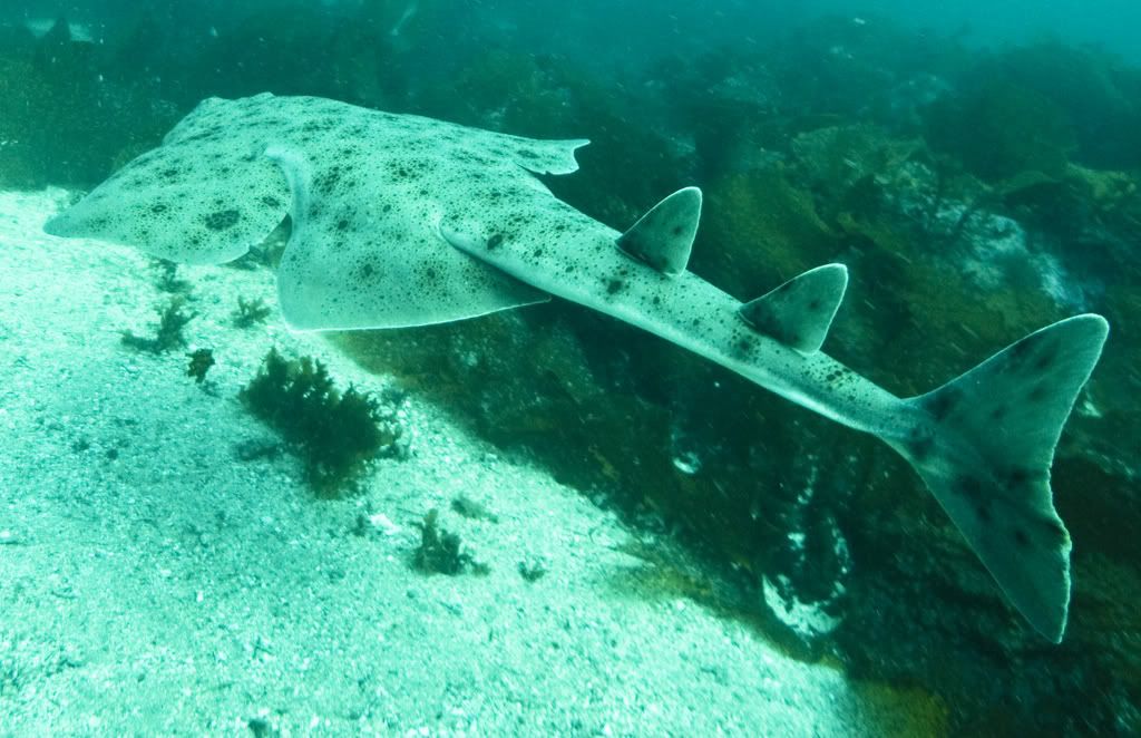
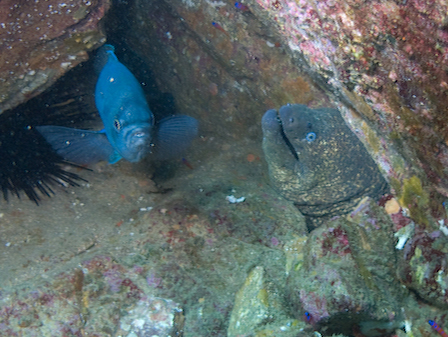
    Here are a couple of my recent attempts at editing. Like you said...it's subjective to the individuals, but any critique or input would be much appreciated.


    Before......


    cat46.jpg


    cat24.jpg


    After......


    cat36.jpg


    cat43.jpg

    Edited by sideways
  4. Greg,


    Great advice from Steve, and I would echo what he said about erring slightly this side of over-cooking things (especially with saturation - I just gag at some of the photos I see where the color is so intense/fake it ruins the picture). OTOH, many people don't use contrast as much as they could, so don't neglect that control (I think Lightroom has it, doesn't it?!). I'm waiting for LR 2.0 to arrive, and will have to learn it myself (I've been using CS3 and PS Elements).


    As for the two photos you posted, I think the first is quite well done, but a little too severely cropped. Consider putting the moray's head at the "rule of thirds" junction, rather than nearly off the frame. The colors also look slightly overdone to me; I'd rather have them look less intense so they look more natural.


    I think the second one is extremely well done - you've fixed the white balance, and it looks "realistic" (e.g., the water at the top looks nice an blue, but not fake) overall, which is what you're going for. That is a great example of how powerful white balance can be - it took a photo that was far too green, and made it look "natural."

  5. Hi Greg,

    The first photo is a pretty classic example of the kind of images we beginners come home with on our first attempts. The subject is too far away to be sharp and kind of dissapears into the rocks. I've got lots of pics like this one. :) Is it taken at Catalina? If you zoom with the crop tool it gets a little better as you've done but it's still going to be soft just because there is too much water betwen the lens and the eel. I constantly have to work on zooming with my fins, the classic comment on this shot would be to get closer. The processing you've done looks OK, colors might be a little too saturated on my screen, the catalina gobies show up a little over the top. This happens when we try to recover because we didn't get close enough to start with.


    The other thing I notice from this image is that it doesn't look "balanced" to my eye. Folks who shoot on land are used to holding the camera horizontal or vertical. U/W there is no reason to do this. If we open up our concept of what is "right" it leads to a different perspective. It's fun to play with our images with the rotation capability in the LR crop tool to help us see different ways we could shoot it next time. Try this one on;

    post-4526-1218304994.jpg

    I was trying to balance the image with your two subjects, I like this composition better but try it yourself. Nothing says you have to hold the camera level.


    The second shot is pretty cool, normally I don't favor tail shots. Usually means the fish was scared and makes it hard for anyone to connect with the image. In this case though the great form looks nice lined up with the white sand and stands out from the kelp. Color looks good to my eye too. If I was going to be picky the white highlights in the sand look blown out but it doesn't really hurt. Just for fun grab the recovery slider and see if you can pull the highlights back. See how the white outline of the fins look unnatural, this can come from oversharpening too. Just my thoughts, some other folks will jump in and help.

    Have fun,

    Steve

  6. Greg,


    Great advice from Steve, and I would echo what he said about erring slightly this side of over-cooking things (especially with saturation - I just gag at some of the photos I see where the color is so intense/fake it ruins the picture). OTOH, many people don't use contrast as much as they could, so don't neglect that control (I think Lightroom has it, doesn't it?!). I'm waiting for LR 2.0 to arrive, and will have to learn it myself (I've been using CS3 and PS Elements).


    As for the two photos you posted, I think the first is quite well done, but a little too severely cropped. Consider putting the moray's head at the "rule of thirds" junction, rather than nearly off the frame. The colors also look slightly overdone to me; I'd rather have them look less intense so they look more natural.


    I think the second one is extremely well done - you've fixed the white balance, and it looks "realistic" (e.g., the water at the top looks nice an blue, but not fake) overall, which is what you're going for. That is a great example of how powerful white balance can be - it took a photo that was far too green, and made it look "natural."


    Bruce,


    When I first posted these 2 examples, I kinda looked at the first one and thought..."Yeah....maybe a lil much on the saturation and vibrance.." LOL. You also make an excellent point about over-cropping. I think as a rookie, and it goes with what Steve says about getting as close as possible, is that with these huge high res files it's easy for me to get overzealous. I remember reading a guide discussing the rule of thirds....guess it's time for me to apply it, or at least make a go at it. Thanks for the pointers...they are well received! Thanks also for the compliments!


    Hi Greg,

    The first photo is a pretty classic example of the kind of images we beginners come home with on our first attempts. The subject is too far away to be sharp and kind of dissapears into the rocks. I've got lots of pics like this one. :) Is it taken at Catalina? If you zoom with the crop tool it gets a little better as you've done but it's still going to be soft just because there is too much water betwen the lens and the eel. I constantly have to work on zooming with my fins, the classic comment on this shot would be to get closer. The processing you've done looks OK, colors might be a little too saturated on my screen, the catalina gobies show up a little over the top. This happens when we try to recover because we didn't get close enough to start with.


    The other thing I notice from this image is that it doesn't look "balanced" to my eye. Folks who shoot on land are used to holding the camera horizontal or vertical. U/W there is no reason to do this. If we open up our concept of what is "right" it leads to a different perspective. It's fun to play with our images with the rotation capability in the LR crop tool to help us see different ways we could shoot it next time. Try this one on;

    post-4526-1218304994.jpg

    I was trying to balance the image with your two subjects, I like this composition better but try it yourself. Nothing says you have to hold the camera level.


    The second shot is pretty cool, normally I don't favor tail shots. Usually means the fish was scared and makes it hard for anyone to connect with the image. In this case though the great form looks nice lined up with the white sand and stands out from the kelp. Color looks good to my eye too. If I was going to be picky the white highlights in the sand look blown out but it doesn't really hurt. Just for fun grab the recovery slider and see if you can pull the highlights back. See how the white outline of the fins look unnatural, this can come from over sharpening too. Just my thoughts, some other folks will jump in and help.

    Have fun,

    Steve


    You called it Steve, that is Catalina :huh: . You bring up a good point, that while I'm basically aware of it....I haven't applied it much when I think back. Thats the not being afraid to swivel the Cam any which way you want tip. Guess it will take just a bit of breaking the "Land" habit. I did go back, and for the first time played with that rotation feature in the crop section. I'll deffinatly start incorporating that into the processing. I like the way in your example that you just rotated it enough, but not seemingly too much!


     

    On the second shot, you are correct. The sand does look a lil "Hot" to me. Good point about oversharpening. I tend to go for the clarity function first thing and crank it up...LOL. Makes up for my crappy focusing, but here you see the problem with too much of it like you point out.


    Thanks for the fantastic help gents! These tips and thoughts are just what I need!


    Cheers!!


    Greg

Aquatica

Account

Navigation

Search

Search

Configure browser push notifications

Chrome (Android)
  1. Tap the lock icon next to the address bar.
  2. Tap Permissions → Notifications.
  3. Adjust your preference.
Chrome (Desktop)
  1. Click the padlock icon in the address bar.
  2. Select Site settings.
  3. Find Notifications and adjust your preference.