Skip to content

Photo / Video Showcase / Archived topic

Oceanic white tip improvements sought

Started by Scubysnaps ·

  • 18Posts
  • 18Replies

Read-only discussion

Oceanic white tip improvements sought

18 posts
  1. Hi guys,

    I've always been shy of doing this but (gritting my teeth here goes! (no previous training!))

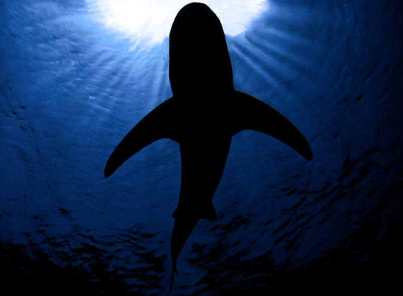
    I went to Marsa Alam last month and got this shot of an Oceanic white tip, I've used it to help me improve my photoshop skills, as as you can see from the original I missed his snout off the shot, so I checked google images for the shape and added it in with paint brush and sorted the rest out as I went along, I dont think I've finished yet but before I have, I thought I'd like to take some gentle c&c from you guys....here's before and after up to now shots, please try and help me improve my skils


    before

    marsa_b4_PS_13_of_46.jpg


    after up to now


    20090522.jpg


    Cheers


    Woody :angry:

  2. Hi Woody. Firstly let me say that as far as photoshop is concerned, I don't know my arse from my elbow... Probably like you, I am self taught, gleaning little bits of advice and absorbing books by the Drahfuls et al...


    As an exercise I think your work has merit in helping your learning curve. And I think you have achieved a very good result and one that is publishable too.


    However... Whilst I am comfortable with the concept of 'removing' unwanted stuff from an image, i.e. divers, gauges, spurious fish, etc., adding to an image is less comfortable to me. I am happy with cloning out some vignetting or enlarging the background to improve composition but to tamper with the subject is taking me too far from my comfort zone.


    All that said, I think the job you have done is a good one and it makes an ordinary image into a publishable one. Just one thing though. The 'ripples / shimmers' around the sunburst at 9 o'clock look odd and draw my eye. Can you improve on these?


    Just my two Zimbabwean two cents worth... Tim

    Edited by Timmoranuk
  3. Hi Woody. Firstly let me say that as far as photoshop is concerned, I don't know my arse from my elbow... Probably like you, I am self taught, gleaning little bits of advice and absorbing books by the Drahfuls et al...


    As an exercise I think your work has merit in helping your learning curve. And I think you have achieved a very good result and one that is publishable too.


    However... Whilst I am comfortable with the concept of 'removing' unwanted stuff from an image, i.e. divers, gauges, spurious fish, etc., adding to an image is less comfortable to me. I am happy with cloning out some vignetting or enlarging the background to improve composition but to tamper with the subject is taking me too far from my comfort zone.


    All that said, I think the job you have done is a good one and it makes an ordinary image into a publishable one. Just one thing though. The 'ripples / shimmers' around the sunburst at 9 o'clock look odd and draw my eye. Can you improve on these?


    Just my two Zimbabwean two cents worth... Tim


    Hi Tim!

    Thanks for your comments! yes I've followed a similar learning curve to yourself by the sounds of it! I realise it was slightly odd, that is the reflection line, I could cut it and rotate it in that area I guess!? (thanks for bringing it up tho else I probably wouldnt have bothered) so the ripples dont form the ellipse, will try and work on that later, also trying to bring his tail out of the dark too by cloning and healing some more light blue in that area then pasting his original tail back in and blacking it up to go with the present one, any other suggestions to do any of that or anything else? Its the first real time I've actually added into a shot too Tim

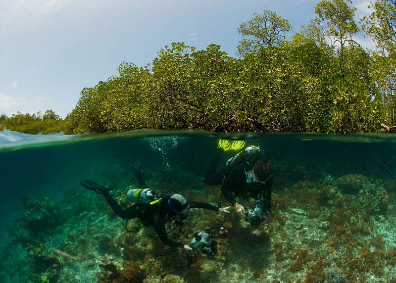
  4. No doubt too late to do now, but my solution has been to graft separate images taken at the same time, so that what's added is "real". This seems a little more acceptable than drawing or adding from unrelated images. I've done this most often with "over/under" images. I make layers from each image, then use masks to block off the unwanted parts and grey gradients in the layer masks to achieve a smooth blend:


    post-4522-1246197703.jpg


    The right background and right side of the wobbegong (as viewed) come from two additional images.


    post-4522-1246197714.jpg


    The left air/water interface is from a second image, written over a particularly prominent splash.


    I wouldn't know about publication, as I've never been in a position to find out what is publishable, and what isn't. You had better go with t'other Tim on that...


    Tim


    :angry:

  5. I understand what you say altho I have not yet had the opportunity to try that as yet on any shot....but that was the only shot I had from that angle anyway, and never got another opportunity to dive Elphinstone

  6. 20090522-1.jpg


    ripple sorted with cloning the ripple below, and added a clearer tail in and cleared its profile up a bit, and blurred the sunlight rays adown a bit...any more!? was thing of adding some exposure to its head as it seems a little fake(!?) with it all black? I tried using the dodge tool with no hardness but its all too blotchy looking, any help on this or anything else would be most appreciated.

    When you say it could be publishable???? where would you mean? and how would I go about trying to do this?

  7. The publishing route for the amateur is, IMO, with the photo agencies. I work with a couple and FTP high resolution jpgs to them. Once the images are included in their online cataloges they return a modest revenue on a 50/50 basis. I could easily see your image being included and bought.

  8. The publishing route for the amateur is, IMO, with the photo agencies. I work with a couple and FTP high resolution jpgs to them. Once the images are included in their online cataloges they return a modest revenue on a 50/50 basis. I could easily see your image being included and bought.

    Wow Tim! Thanks for that :angry:

    How would I go about getting it on their online catalogue? PM me if you prefer

  9. Hey Woodster,


    You might want to consider getting the water color back to the blue I believe it was in your original shot. I modified the WB and shaded the aqua color hue a tad in LR. Easy to fix. Unless you wanted the green?


    post-4526-1246257596.jpg


    Have fun!

    Steve

  10. Hi Steve,

    Yes thanks for that!! again, something I did notice, but didnt really pick up on it.


    Hey Woodster,


    You might want to consider getting the water color back to the blue I believe it was in your original shot. I modified the WB and shaded the aqua color hue a tad in LR. Easy to fix. Unless you wanted the green?


    post-4526-1246257596.jpg


    Have fun!

    Steve

  11. I understand what you say altho I have not yet had the opportunity to try that as yet on any shot....but that was the only shot I had from that angle anyway, and never got another opportunity to dive Elphinstone


    ... ain't that the truth (whenever you don't quite shoot something wonderful, there's no going back!)...


    I do like your creation; but going back to blue makes the silhouette less clear: what happens if you increase the overall brightness?


    Tim


    :)

  12. Nice!


    Black and white it though.


    The colour doesnt add anything to the image for me.


    Cal

  13. Thanks for the background commnets, will try them all next time I get a chance...as to the black and white one, I see your point but I've never opted for the b&w option, I always seem to think its used on pictures when its a last resort (or the easy option) on making the most of the pic? But I'll give it a go anyhow :)

  14. Woody, conversion to B&W is awful if executed with PS greyscale. I have found Nik Software Silver Efex does a great job, or try PS channel mixer, or some free PS / Lightroom preset downloads at ononesoftware.com

  15. Yes Tim, I seem to remember the channel mixer option for B&W from J&S Drafhals PS book :) Might give it a go!

  16. You'll find a good tutorial on channel mixer on the BUPG www site.

  17. Here's my latest attempt


    20090522-2.jpg


    not much different to the last one but a bit of blue and a bit of brightness, thanks chaps :)


    Could you help me with a more difficult one for me......

    before

    marsa_b4_PS_14_of_46.jpg


    after

    120090522.jpg


    I seem to be struggling to make it any better, is it a write off, as you may know I was asked to turn my flash off so its belly isnt lit up and all dusky, and the background is touched up...maybe beyond further repair? opinons please if you would be so kind


    Cheers


    Woody :clapping:

  18. I don't want to be a party pooper, nor start a discussion on the ethics of photoshop manipulation, but i'm more skeptical about the concept of adding the snout into the image. I would not say it's publishable, though i'm not quite sure where different photo agencies & magazines draw their lines.


    I guess it all depends on what you wish to do with the image. If you want something nice to frame on your wall, then do whatever you want. If you want to distribute the image commercially, the manipulation needs to be specified. Its all too easy these days to just change something in PS and we all begin to wonder if some photos are 'real' or not.


    Personally i started as a photojournalist, so try to avoid the concept of changing the reality of an image. In journalism its 100% unacceptable.


    I think most consider removing backscatter ok, as I do. I've even layered a couple over/under images with 2 raw conversions of the same image and blending to balance the above & below exposures (not for journalistic publication...). Similar to dodging/burning just more efficient.


    On the other hand, i've started doing a lot of interior work and am trying to come to terms with the fact that much architectural photography is heavily manipulated, to a surprising degree. And its often commercially acceptable in that industry.


    I do think its a little much to try and get rid of all the bubbles in that second image, it would be really hard to make it look natural. Hoards of bubbles in an otherwise beautiful image like yours is always disappointing, maybe we shoudl all switch to rebreathers!!


    I'm certainly not trying to tell anyone what to do with their images, just playing a bit of devil's advocate, another perspective to consider. cheers,


    chris

Scuba.com

Account

Navigation

Search

Search

Configure browser push notifications

Chrome (Android)
  1. Tap the lock icon next to the address bar.
  2. Tap Permissions → Notifications.
  3. Adjust your preference.
Chrome (Desktop)
  1. Click the padlock icon in the address bar.
  2. Select Site settings.
  3. Find Notifications and adjust your preference.