



Hi,
I tried photobox last year when I made a calendar but a lot of colours on my images were mis-represented, can anyone maybe recommend one that gives you images as you see them when you order them?
Cheers
Paul
Shooting Technique, Workflow and Editing / Archived topic
Started by Scubysnaps ·
Read-only discussion
Hi,
I tried photobox last year when I made a calendar but a lot of colours on my images were mis-represented, can anyone maybe recommend one that gives you images as you see them when you order them?
Cheers
Paul
Hey Paul,
I think you're seeing the lack of calibration pop up again. Here is a quote from the Photobox site.
Colour calibration
An image that looks great on your computer screen should look equally wonderful in print. If you’re finding this isn’t the case it could be down to the colour calibration of your monitor. This can cause overly bright or dark prints, or unrealistic colours compared to your original. Even if you’re not aware of this, properly calibrating your monitor is still a good way of ensuring impressive results.
For more in-depth quality information please check out our technical page.
Cheers,
Steve
Hi Paul,
Ive caliberated my monitor, what you need is to get something like a 'ColourVision Spyder 3 Pro' just google it and you can get them for less than £100. It works great it comes with a device they call the spyder that clips over your monitor. It then runs a series of tests to determine the correct caliberation.
I editied up a load of my Egypt phot's from last year on my LED laptop screen only to discover when I looked at them all on my desktop with the proper caliberated screen the color balance was way off, I ended up having to do it all over again.. :s
Hi Paul.
Until you calibrate you are shooting apples, looking at oranges and printing bananas!!!!!
You may get some good results (by luck) but you can't get any consistent results!
The calibration gear is cheap enough (look at the Eye one), and the proces is pretty simple too.
Adam
I was amazed at the difference when I first got a calibrator.
I got the spyder 3 elite, so now when I watch movies from my laptop via LCD TV or projector they can be calibrated as well......Quick and easy to do as well.
When you think how much money we spend on the kit to get the best image quality is it really worth throwing it away at the output stage!! I paid more than that for a 1 gig memory card when dSLR were first emerging.....
ok...would you mind me testing your calibrated screens then to prove something?
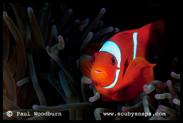
This image is pefectly exposed IMO, and is one that I had problems exposing on print, could you, perhaps , save this image and alter the exposure so you see it correctly on a calibrated screen, and we can compare?

My monitor is calibrated to a gamma of 1.8 and a colour temperature of 6500K. Photobox prints are almost perfect, unless the image is predominantly dark when they look a little under-exposed. I've left your corrected image as sRGB, tho' I send Adobe RGB files to Photobox. I have just set the brightest part of the lateral stripe to white and left the black between the tentacles black. It looks moody but vibrant on my monitor where the original looks under-exposed:
Tim

I tried photobox last year when I made a calendar but a lot of colours on my images were mis-represented, can anyone maybe recommend one that gives you images as you see them when you order them?
Eleonora got two calendars made at Christmas (one underwater, one dogs) using Photobox. I warned her that the odd image might not look as nice as on the screen, but I was wrong. I processed the images on my computer (calibrated screen) and all the photos in the calendars were spot on. Very impressed. In fact everyone who sees them is impressed.
On my screen you picture would print very dark, with much of the detail lost in the dark areas. Tim's version looks much better. I'd suggest the problem is on your screen rather than the printers?
Alex
calibration is the key for sure. Once that is done colour-life will be so much easier for you
In addition I use this very common, standard file as a known reference. It is in Adobe (1998) colour space.
I have prints made from it on the various substrates I use on my EPSON 9800/Onyx RIP printing system n the office and samples printed from it by the lab and commercial press printer I use. If I ever consider another paper stock I print this file on it. If I am ever approached by a new supplier of print material, I get them to print this file first. And I keep them as a reference.
All substrates and papers and inks/dyes/chromagenic processes respond differently to the same files, and this gives me an idea of the subtle (or otherwise) differences of the particular print system to be used for a job.
Whilst not recommended as an alternative to calibration...In my kit I carry the most common reference prints I use and the file is on my carry-all USB stick. If I've had to work on an unfamiliar / un-calibrated system for some reason... I simply open the file, pull out my most commonly used reference print, and manually adjust the monitor (if the monitor allows) until the file on screen matches print in hand. Never perfect, not scientific, and more difficult as wide-gamut monitors become more available... but gets me in the ball park... and has saved my butt on occasion.
Many will know the file, it is very common.

Paul:
Another thought: what does the histogram of your anemonefish look like? Images look right on my monitor when the histogram runs from white to black, usually peaking a little to the left of centre. Photobox prints look bright when the histogram peaks roughly in the middle.
Tim


Terms of Use Privacy Policy Guidelines We have placed cookies on your device to help make this website better. You can adjust your cookie settings, otherwise we'll assume you're okay to continue.

A worldwide community for underwater imaging.