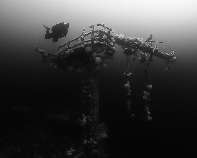
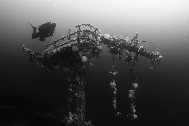
Thoughts on the pic below? It feels lacking in contrast and has an odd composition in that there's quite a bit of empty space. On the other hand, perhaps that adds to the atmosphere of the pic? I've played with cropping and adjusting the contrast, but have been dissatisfied with the directions I've tried. As is, I think it has a bit of that fantasy 'floating around wreckage in space' feel. The pic is a little unsettling to me, perhaps amplified by the imperfections?
What would you do to this pic?
This pic was taken last week in Nanaimo, BC, Canada. It's the HMCS Cape Breton. We had about 40ft of vis on this particular dive.
Hi Zhiji and welcome to Wetpixel!
This shot is indeed a bit unbalanced (composition). It might be more pleasing to an eye if the construction's of the wreck would be a bit more to the right and diver more to the left. But that You can obviously fix only by reshooting.
I'm sure You have tryed diffrent croppings, but maybe a square would work better?
I played around with You'r shot a little, but theres not much to do with a low res jpeg
Just my 2 cents
Cheers
Karel
Hi Zhiji,I like it. I might increase the exposure on the lower half to bring out the column a touch more. I played with a slightly different crop and burned a half stop up on the white anemones, darkened down a half stop on the lower left. Lots of options here. I like Karel's thoughts too.
Looks like fun,
Steve
I'm with Steve on the crop and might even burn a little more on the wreck "column".
Cool shot.
Phil
If the original was shot in color, there is a conversion technique in photoshop that can add tremendous flexibility to the contrast of the finished B/W. Sometimes the improvements are remarkable. If you could post a color version, I'll give it a go, and explain the steps thoroughly.