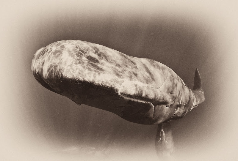
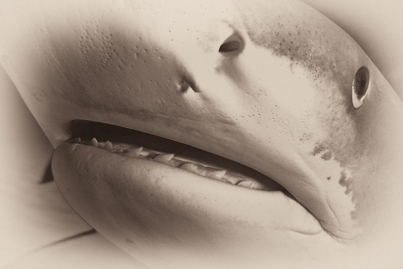
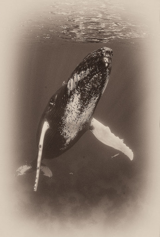
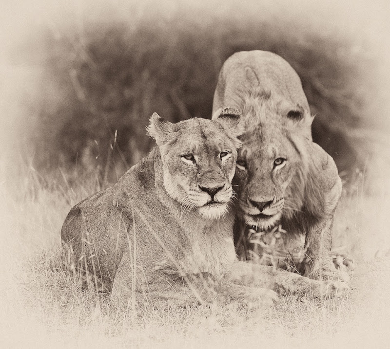
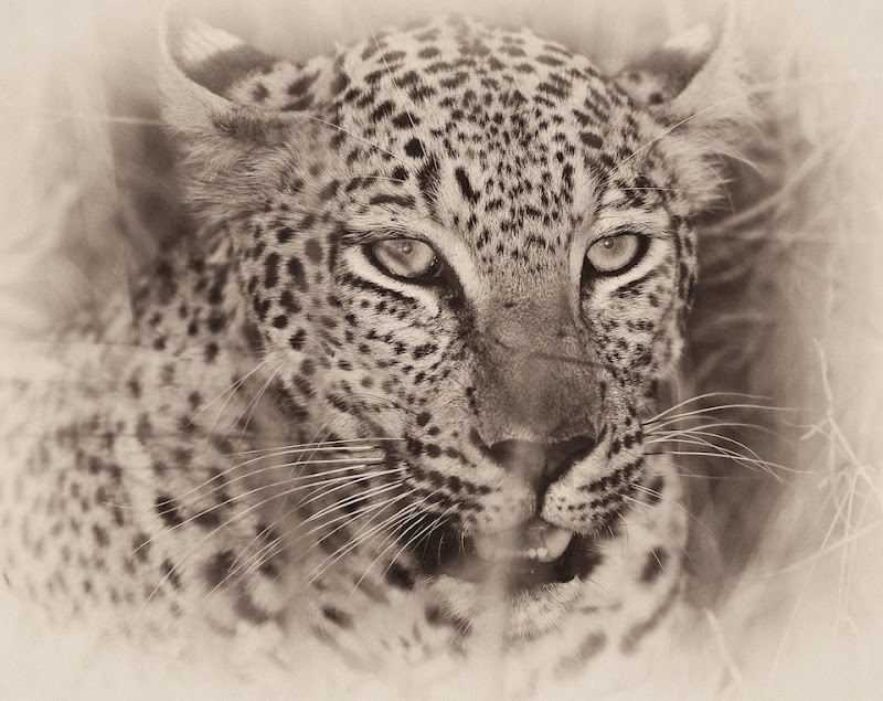
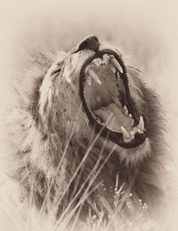
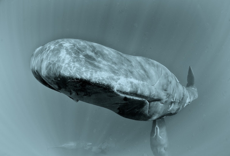
I'm working on a series of wildlife images for an interior decorator; who is requesting a sepia / antique look. I've been quite pleased with some of my topside wildlife images, not so sure about the underwater.
Here are a few underwater and topside images, I'd like some opinions and also it would be great to see if others have tried anything similar with any success.
I guess this also speaks to whether anything like this would have a place in competitions as equivalent say to B & W
Hi Jeff,
Nice effect. I think the Africa pictures totally work - gives them that old, colonial era feel. The underwater ones I'm a little more iffy on and I think it's really going to have to be image by image. I like more negative space around the subject like the topside shots for the vignette to work for me. Thus, I like the humpback a lot, the shark not so much. I think the sperm whale would work better if it was just the one animal.
My 2 cents...
Phil
Jeff ... I agree with Phil ... I think the safari shots work a bit better than the U/W ... although I love the humpback ... and on that one I might be tempted to clone out the two small fish and what looks like a few dust bunnies.
These will look amazing on the right fine-art matte paper with the right framing and presentation.
I love the topside work and not so much with the underwater ones.
Regards Mark
Thanks guys; sort of my feelings as well, sepia tones just do not quite work underwater. I could imagine wreck shots might work.
Cyanotype look may be a more appropriate match with underwater.
Hey Jeremy, good to hear from you.
Thanks guys; sort of my feelings as well, sepia tones just do not quite work underwater. I could imagine wreck shots might work.
Cyanotype look may be a more appropriate match with underwater.
Hey Jeremy, good to hear from you.
I like em all. I did an antique toning on a B&W conversion for a rig dive that I had strobe firing problems on. I kind of like the effect myself. Doesn't hold a candle to your images but I thought it fit the subject nicely:
I like em all. I did an antique toning on a B&W conversion for a rig dive that I had strobe firing problems on. I kind of like the effect myself. Doesn't hold a candle to your images but I thought it fit the subject nicely:
Yes, I think something like this rigs ,wrecks etc sepia and the antique look works...
Jeff,
I think the Cyanotype whale looks great. I'd play with that a little more on the other underwater images. Interesting project.
Cheers,
Steve
Hi Jeff!
For UW I like the Cyanotype look better. Maybe it's the blueish tone reminding natural water...
Awesome pictures by the way!!!
Cheers
Karel
I agree with the others, the Sepia does not work to well with these UW photos.
The Cyanotype is better, but how did straight B&W look. My feeling is that at least the two whale photos will work well in B&W.
Another point to keep in mind is the mood the interior decorator wants to create. If the after a "warm" interior, it might also rule out the Caynotype.
Beautiful photos!
I dont know about the others but for me except for the first shot all work well. In fact the shark image really looks nice.
Cheers,
Diggy
Thanks for all the input; I will probably give the designer a few options. Of course that's digital cool, show her the options on the iPad before printing.
I don't think the Sepia underwater ones work because there's no real point of reference. I've never seen a sepia underwater photo so I don't I can fool my brain into thinking it's really real. That said I really like the sperm whale - it's the one that works best for me.
For the Safari pictures they look a little unnatural to me - and I think the problem is that the original pictures are so crisp that it still looks modern. Perhaps adding a little noise and possibly a little blur would make them look even more vintage.