I recently moved house and the move meant my monitor travelled and then wasn't used for several months. It is an Apple Cinema display on Mac Pro and it is reasonable old now - the style with metal all the way around.
The monitor is/was calibrated (Spider 3 - at 6500K, 2.2 - or more recently D65, L* on Coloreyes) and I have always been happy with how my images look on screen and how they print (in magazines - I am not a home printer). Many people often comment that my pictures are regularly the best printed in a mag (particular in Dive in the UK, where I write a column each month). I just calibrated semi-regularly and never gave it much further thought.
But since the move - I have not been getting calibrations that look right to me - they are not far off - just look a bit greeny or muddy looking on yellows! It is very minor - and I have had no complaints from anyone I have sent images too recently. I also think it might be because I have got used to my laptop screen as a standard while I have been on the road!
But this slight colour cast is across everything on my desktop - even a blank document. I have resorted to calibrating at a slightly high K - 6700, to get them looking right - but this doesn't seem like a good idea to me. Or is this a reasonable compensation for drift in my ageing monitor.
Anybody got any suggestions? Maybe it is time for a new screen, or maybe my spider hardware needs replacing? Or should I just ignore it! This is a minor thing - it is just something that was zero problem before.
What are other people calibrating their studio displays to? If I use D65/6500K settings - mine is slightly too greeny/muddy.
Alex
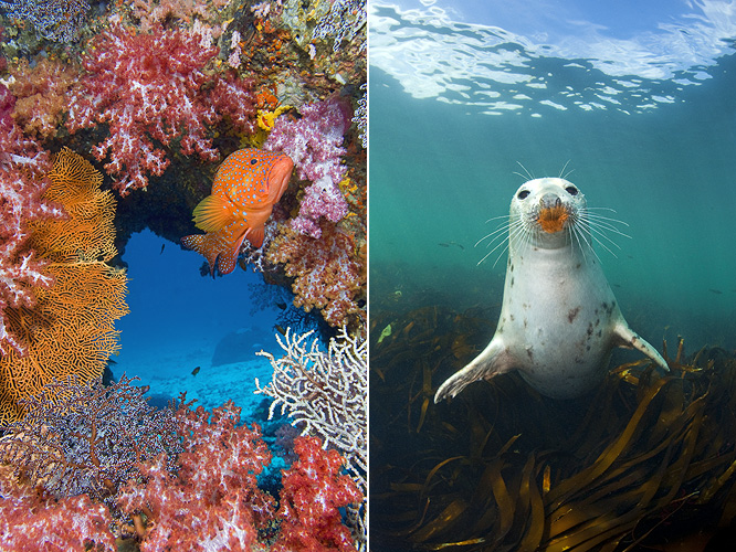
p.s. Here are a couple of images for evaluation - please note they are in Adobe RGB 1998 colour space - so should be downloaded and viewed in Photoshop. One is a saturated and colourful reef scene, one is a UK shot, with a natural greeny colour cast. I would like to know if you see a colour cast across both images or not (I am not interested in minor comments on colours).