Wanted some feedback on the following pictures of a Pacific Giant Moray. I realize that the colors are brighter and more saturated than they are naturally but this was on purpose, artistic liberty . Let me know what do you think, do the colors work? Thanks
very cool! i prefer the focus on the eyes in the 2nd personally
I like the colors overall although the teeth are a little blue and the colors would look better to me if the teeth were more white. Other than that I like the colors and nobody who didn't know would be able to tell the difference in color anyway. The main thing I notice is how the depth of field isn't large enough. the first shot the nose is in focus but the eyes are out. Then the eyes are in but the nose it out of focus. It can tend to subconsciously bother the viewer if the foreground in an image is out of focus. the depth of field should be increased to show both the nose and the eyes in focus and then these would be incredible.




 . Let me know what do you think, do the colors work? Thanks
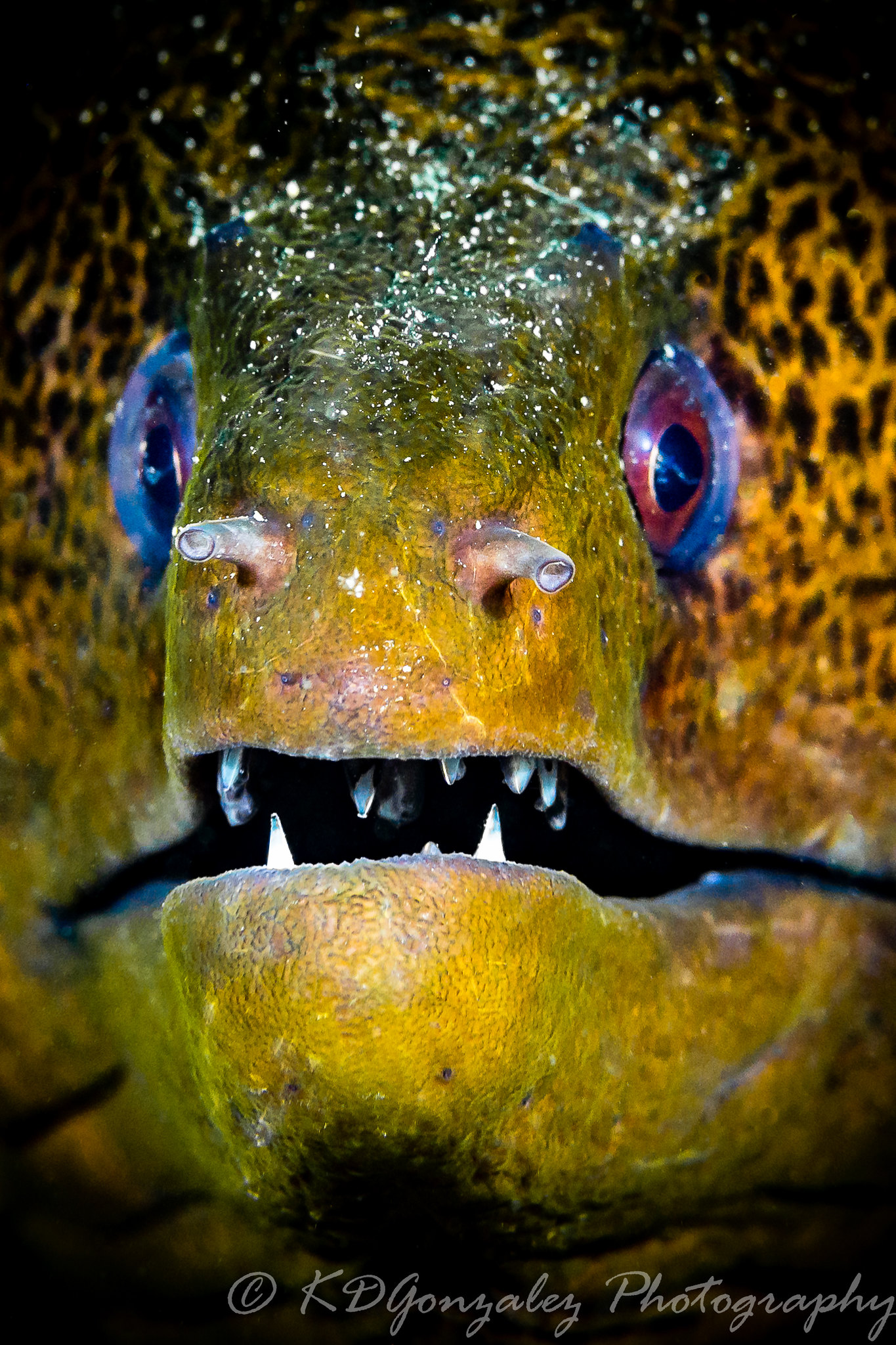 Fiji-37 by Karyll Gonzalez, on Flickr
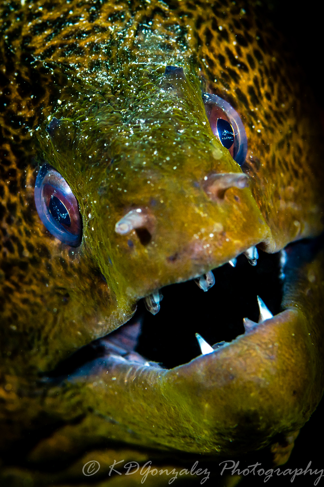 Fiji-35 by Karyll Gonzalez, on Flickr
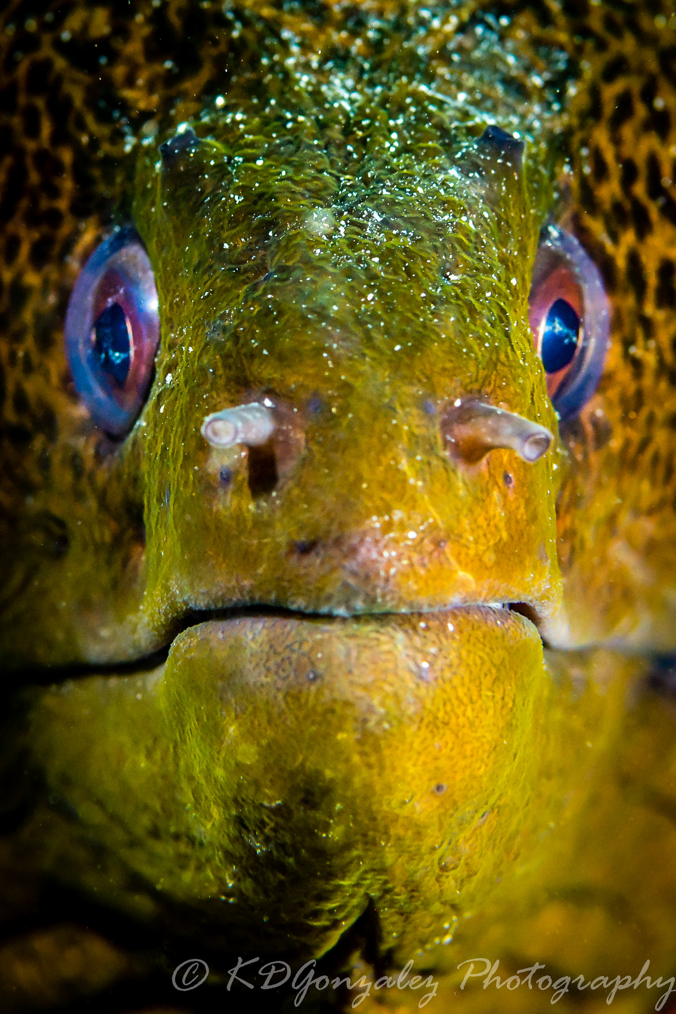 Fiji-36 by Karyll Gonzalez, on Flickr

