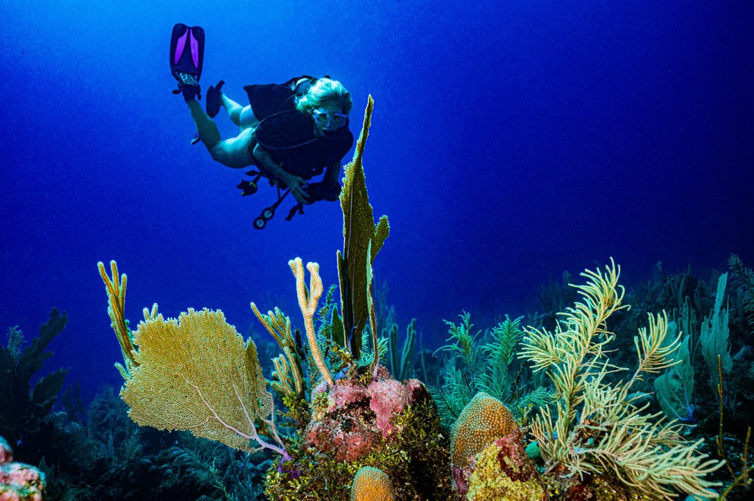
I have been told by several pros that my images look over processed. Too much contrast, water is too blue, colors are too vibrant, etc. I love the rich colors, contrast and clarity I get from Lightroom in my images but I guess I overdo it. I have tried to tone it down but always wind up pushing the sliders too far again and again. Sometimes I think post is as much of an art form as capturing the image! How do you keep from over processing your images in post? Any tips would be appreciated!
Larry
Shooting Technique, Workflow and Editing / Archived topic
How do you keep from over processing images in Lightroom?
Started by UWPics ·
- 12Posts
- 12Replies
Read-only discussion
How do you keep from over processing images in Lightroom?
12 posts
-
-
13 hours ago, UWPics said:
I love the rich colors, contrast and clarity
Hey Larry
I think you have answered, maybe, your own question: you love the look. Who is to say that is not "right"? When it comes to creating images, what is right and what isn't?
I guess if you are looking for colour accuracy, then maybe that's an issue. But even colour accuracy underwater is a dodgy thing to quantify given the absorption of light and all the other factors.
One thing you could try is LR's "YY" view - the Before/After screens. If you like what you have created more than the original and it doesn't look too ?starkly different to your eye, that might help.
Perhaps the other thing to watch out for is the pictogram too. Are any of the graphs way off chart?
Bottom line though, I think, is do you like your image? If it pleases you, great, well done! If not, tweak away: backwards, forwards......
-
4 hours ago, TimG said:
One thing you could try is LR's "YY" view - the Before/After screens. If you like what you have created more than the original and it doesn't look too ?starkly different to your eye, that might help.
Thank you Tim, great suggestion. I will try the YY view next time I am editing. So there are no hard and fast “rules” then, great! Yes, I do like the way my photos look when I enhance the color and clarity in LR, but will try not to over-do it from now on.
-
As Tim says, it's your final output , and it's your photography. We all process things differently, some people go for more cartoonish colours, others prefer less contrast. Others still prefer to go for artistic 'moody' looks.
Do you have some examples? Maybe people could offer suggestions, but remember they are suggestions only - some may look better with the advice, but you may think others look worse as a result.
There are definitely no hard and fast rules
Mike
-
Hi Mike,
Here is one of my shots from about a year ago that a professional underwater photographer said was "too much blue" and "too much contrast", but great composition. I rather liked this photo at the time and was quite disappointed, but took the criticism as constructive for improving my photography. I have gotten better in the last year, and have tried to tone it down since then.
Thanks for your help!
Larry

-
Larry's post made me think that it's always worth going back to a pic a few days after you've edited it - to see if you still like it the way you left it. I often find, naah, it's not right and, often, I hit the delete button.
-
58 minutes ago, UWPics said:
Hi Mike,
Here is one of my shots from about a year ago that a professional underwater photographer said was "too much blue" and "too much contrast", but great composition. I rather liked this photo at the time and was quite disappointed, but took the criticism as constructive for improving my photography. I have gotten better in the last year, and have tried to tone it down since then.
Thanks for your help!
Larry
I agree with the others - if you like it great!, but there are some things to consider, when you are pushing the saturation up you risk blocking up colours and losing detail. I would suggest having the clipping warnings on and watching your 3 colour histogram for blocking up - that is the histogram hard up against either end.
Perhaps do you normal edits then open it up fresh again and process it again keeping an eye on clipping and see how you like the difference. I can see some artifacts in light to dark blue transitions which are possibly die to heavy handed saturation work. Also on my monitor it is a little dark - often this is cause by your monitor being too bright - most monitors are too bright out of the box for photo work.
-
Great suggestions Chris! I have never heard of the "clipping warnings" and will look into how to turn them on. You are 100% correct, the histogram is skewed over to the left side on this edit, and I did push the blue saturation up +54 (way too much I suppose). I am also looking at getting some decent photo editing monitors and am researching the best monitors for the price (the good ones run all the way up to $5000 US each!). I am torn between getting a pair of these monitors:
2 - BenQ PD2700U 27 inch 4K Monitor for Designers 3840x2160 UHD IPS panel with AQCOLOR @ $499 US each
2 - ASUS ProArt Display PA279CV 27” 4K HDR UHD (3840 x 2160) Monitor, IPS @ $489 US each
These are exactly the tips I was hoping to get when I created this post! Thank you!
Larry
-
So I went back to the RAW on that photo and re-edited from scratch following the tips you guys suggested. The histogram is nicely balanced and the result is much more natural looking. There are some artifacts in the blue water from backscatter removal but that's a whole new topic!
Anyway, here is the result
Thanks again for the great tips!
Larry

-
3 hours ago, UWPics said:
Great suggestions Chris! I have never heard of the "clipping warnings" and will look into how to turn them on. You are 100% correct, the histogram is skewed over to the left side on this edit, and I did push the blue saturation up +54 (way too much I suppose). I am also looking at getting some decent photo editing monitors and am researching the best monitors for the price (the good ones run all the way up to $5000 US each!). I am torn between getting a pair of these monitors:
2 - BenQ PD2700U 27 inch 4K Monitor for Designers 3840x2160 UHD IPS panel with AQCOLOR @ $499 US each
2 - ASUS ProArt Display PA279CV 27” 4K HDR UHD (3840 x 2160) Monitor, IPS @ $489 US each
These are exactly the tips I was hoping to get when I created this post! Thank you!
Larry
I would go with the BenQ, though if you can stretch the budget this is the better model: https://www.bhphotovideo.com/c/product/1481844-REG/benq_27_sw270c_professional_ips.html
The cheaper model basically covers sRGB while the better model covers Adobe RGB colours. Abobe RGB covers a wider range of colurs in the blues and greens. I always suggest going for the best monitors you can afford. My reasoning is you may be spending 10 of thousands on UW camera gear and quite often the main product from that investment is what you see on the screen when you edit the images.
I agree your second image is more natural looking but again if you are not selling it - it's up to you to decide which you prefer.
Another thing you could try is seeing if other people are prepared to edit one of your files to see what they would do with the image. For best results editing one of your raw files.
-
I agree the repost is much more natural in terms of colour, the original is very heavy on black and saturation meaning a loss of detail - however as we keep saying, it's personal choice!
If you want me to take a look at the RAW file just PM me, if not, no issues
Mike
-
Questions to the original poster:
Are you working on a calibrated /profiled monitor?
Could there be some unwanted conversion going exporting from Lightroom : If you convert from Adobe RGB to sRGB (to better use it on the web) and you have not previewed the conversion it can give strange results.