- 23Posts
- 23Replies
Read-only discussion
monochroming
-
-
-
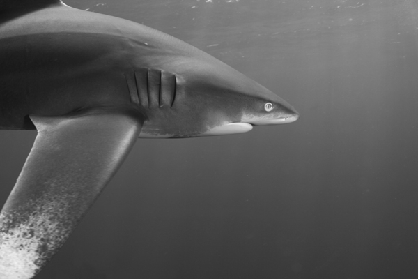
I would say somewhere in between. Giles' contrast is a bit too much for me....But it did show up the sunbeams a bit...
-
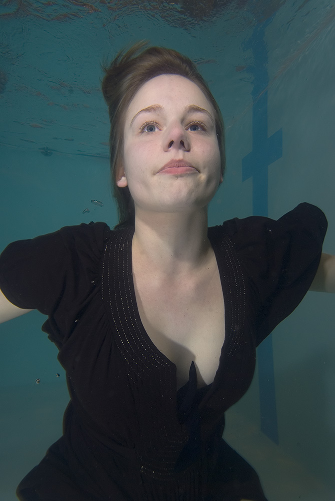
I've been curious about this too. When you have options for monochrome filters - yellow, blue, orange, etc...which do you pick? In my case I wanted to mono this one because it was underlit, so very aqua....but using the blue filter made it all look washed out.
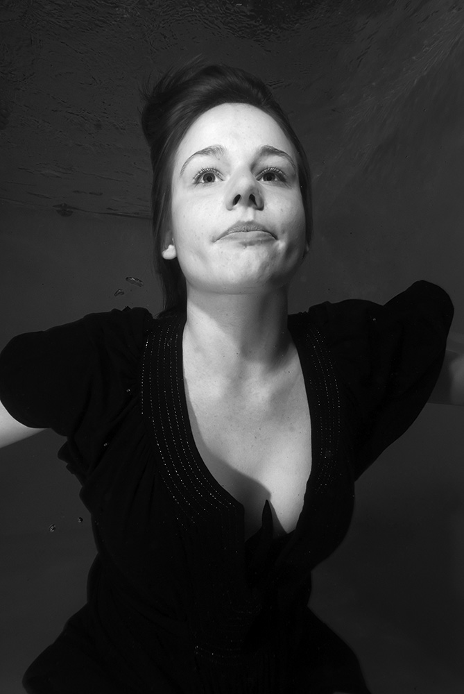
Here's one of mine that I think came out okay, but I would've always liked more contrast without making it look too fakey. (Looks darker as reduced by forum - click to fullsize).

-
How are you guys doing your conversions? It can make a big difference.
Particularly underwater, taking a good look at your channels in PS and seeing which channel looks best is a good starting point for creating the best B&W conversion.
Thinking in terms of channels is helpful and there are a bunch of tutorials on this like here
http://www.adobe.com/digitalimag/pdfs/phs8bwconversion.pdf
http://www.bythom.com/bandw.htm
Prior to CS3 I think using this technique with Channel Mixer worked well, Photoshop CS3 now has the Black & White adjustment which incorporates concepts of the channel mixer.
-
Prior to CS3 I think using this technique with Channel Mixer worked well, Photoshop CS3 now has the Black & White adjustment which incorporates concepts of the channel mixer.
I am using cs1 and actually processing the image in levels, sharpening and then applying channel mixer.
cheers for the links i will have a look.
stew
-
Hi!
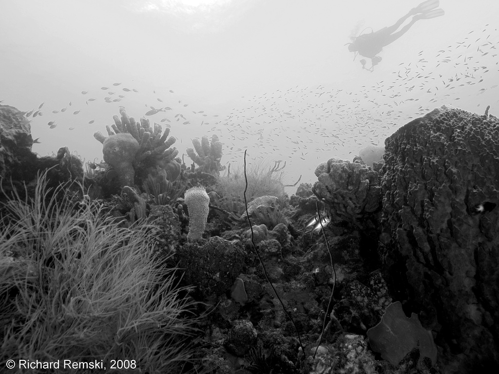
What I do is maximise the tonal range in levels after using channel mixer to make a monochromatic conversion, dominated by the green channel. The blue channel doesn't help much and the red channel tends to blow out the highlights, particularly around the sun. As monochromatic images are all about shade contrast, I am trying to stretch out the luminance curve to fill the full gamut of available pixel intensities from (000,000,000) to (255,255,255) in RGB. To do this, the levels conversion needs to be repeated after the mono. conversion.
If I use levels on your image, this is what I get:
The blackest part of the image is rendered as black, and the lightest part as white.
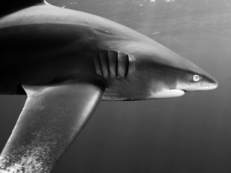
With this image I processed the colour version a little, then used the same conversion technique:
I'm not sure that the web reproduces the full gamut, but the principle is there.
What do you think?
Tim

-
-
Oh, crikey ... yet another digital technique I know nothing about ... here comes another lost weekend ...
-
HI Tim
I am liking this one the most. Although I am waiting for Steve Williams to produce something as he usually does a good job with other peoples images.
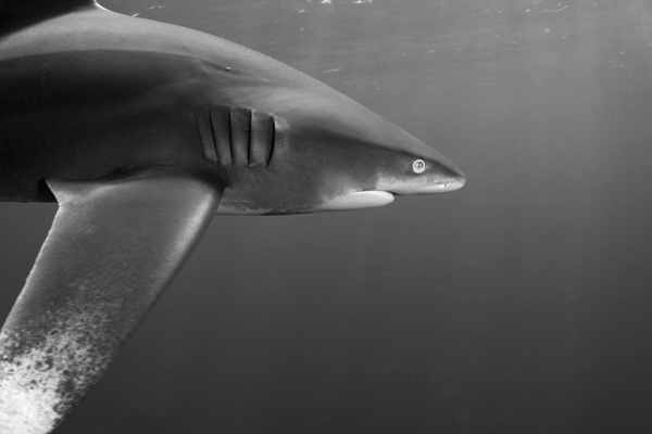
I only made adjustments with the green channel for mine, but did not re adjust in levels. I think this works well. Of course what works for one shot might not work for another.
Cheers for the pointers, happy editing.
Stew
-
Although I am waiting for Steve Williams to produce something as he usually does a good job with other peoples images.
Hi Guys,
I respectfully bow to your expertise when it comes to B&W images, heck color too for that matter. I have worked my way through Scott Kelby's four different conversion methods he describes in his Photoshop book and I've found the best method depends a lot on the image. I've been playing with the conversion in LR and as usual it's much easier and much faster than PS but I need a RAW file to play with, so I was just sitting back and learning from the pros.
Stew I appreciate your confidence in my ability, I hope someday to have the reputation of doing a good job with my own images. Cayman in 5 weeks.

Tim's image looks the nicest to my eye on this screen. I'd love to see what Gile's image looks like when it's printed.
Cheers,
Steve
-
Cayman in 5 weeks.

Tim's image looks the nicest to my eye on this screen. I'd love to see what Gile's image looks like when it's printed.
Cheers,
Steve
I know you lucky thing. I hope you pick up loads of good stuff from Alex. I dont know when you were last in the water, I was only diving in october but i am bloody itching to get back in. It drives me crazy living in such a cold country. I am too much of a softy to dive over here.
Agree with you that Giles image would look better printed.
keep smiling, Stew

-
Cayman in 5 weeks.
Lembeh and Raja Ampat in 8 weeks (and, for my British audience, Guildenburgh in 2 days...)!
Please do not expose Dr M to undue risk as he should be part of the Indonesian extravaganza!
Tim

-
LOL,
I'm pretty confident that he'll make it back to the boat in one piece. The pub crawl could be a whole other thing.

Cheers,
Steve
-
I've been a news photographer for over twenty years and I frequently need to convert color images to B/W. The problem has always been that when colors are reduced to grayscale, the resulting tones of dissimilar colors can end up so similar that it becomes difficult to distinguish one from another. The result can look pretty flat and 'muddy.' When I discovered the "Channel Mixer" in Photoshop, I thought I had found the Holy Grail of B/W conversion methods. But if you have ever used the "Channel Mixer" you may have found (as I did) that it is very easy to loose highlight or shadow detail — or both — in the process.
I don't remember where I learned this method, but I think it is the best yet for controlling color relationships when converting to B/W.
As with most of these tutorials, the explanation seems more complicated than the actual routine, so please be patient and try it as you read.
Open your color image and add a "Hue/Saturation..." 'Adjustment Layer' Don't make any changes, but just click 'OK.' At the top of the 'Layers' palette, you will see a drop-down menu set to the default 'Normal.' Click that and select the option, 'Color' near the bottom of the list.
Now add a second 'Hue/Saturation...' 'Adjustment Layer' and drag the 'Saturation' slider all the way to the left to take all the color out, and click, 'OK.'
At this point you should have what looks like a B/W image. The 'Layers' palette should show that you have a color image with two 'Hue/Saturation...' adjustment layers stacked above it.
Now double-click the adjustment layer you created first. Its the one immediately above your image layer.
By sliding the 'Hue' slider left or right, you can shift the colors — and their relationship to one another — and see the results as you go. The beauty of this method is that you can also select just certain colors to shift by selecting them in the drop-down menu labeled by default, 'Master' at the top of the dialog box.
Unlike the channel mixer, this method will never blow out your highlights. Play around with this and you can make B/W images with incredible control over tones.
Flatten the image when you finish, and don't forget that although you are now looking at a colorless image, it is still in RGB mode, and you will need to 'Convert to Grayscale.'
This works with any version of Photoshop that supports 'Adjustment Layers.' I actually created an 'Action' that adds the appropriate layers and settings. I hope this is of some value to any of you who like to do B/W.
Bentoni

-
Flatten the image when you finish, and don't forget that although you are now looking at a colorless image, it is still in RGB mode, and you will need to 'Convert to Grayscale.'
This works with any version of Photoshop that supports 'Adjustment Layers.' I actually created an 'Action' that adds the appropriate layers and settings. I hope this is of some value to any of you who like to do B/W.
Bentoni

i will be trying this out on a few shots tomorrow, thanks for the info.
excuse my ignorance, but i do not understand why the image would need to be converted to grayscale. ?
-
Of course you don't need to convert it to grayscale — or even flatten it for that matter — but if you want your end result to be a B/W image, converting it would be the last step (which I sometimes forget to do). If you don't convert it, you still have an RGB file which may have an unnecessarily large file size for some purposes.
-
Of course you don't need to convert it to grayscale — or even flatten it for that matter — but if you want your end result to be a B/W image, converting it would be the last step (which I sometimes forget to do). If you don't convert it, you still have an RGB file which may have an unnecessarily large file size for some purposes.
cheers for that
-
I dont know when you were last in the water, I was only diving in october but i am bloody itching to get back in. It drives me crazy living in such a cold country. I am too much of a softy to dive over here.
Come on Stew, Roland and I are going for a dip on Wednesday, buy a drysuit and come in, we went last week and the water was much warmer than the air temperature
there was some great stuff there, not that I could shoot anything that day. Get yourself a drysuit and come for a play.Tristan
-
Come on Stew, Roland and I are going for a dip on Wednesday, buy a drysuit and come in, we went last week and the water was much warmer than the air temperature
there was some great stuff there, not that I could shoot anything that day. Get yourself a drysuit and come for a play.Tristan
no way. you guys are shot to !%$£. I will be out with you both in the summer. I have seen a few of Rolands shots and he has some very good ones from under the pier. That anemone and shrimp is amazing. I will probably get a dry suit for the summer as my 7mm semi dry is too much hard work to get in and out of.
ive got another 6 weeks to wait til the maldives.