



Hi all,
I'm interested to find out whether people prefer this picture in colour or mono.
All critiscism etc gratefully received
Many thanks
Adam


Read-only discussion
Hi all,
I'm interested to find out whether people prefer this picture in colour or mono.
All critiscism etc gratefully received
Many thanks
Adam
Adam,
For me it's the b/w, I think the seal pop's out of the background more, but what do I know!!!!
Lovely shot...
Duncan
I would put different colors than the color-one and keep this. :] (just kill the cyan in camera raw).
colour - but rebalance in RAW taking out some of the green/cyan like autopsea said. cool shot
chris
Colour for me too .. but i am not so sure any adjustments will make it look better.
But there is no need to black and white this one unless going for an extreme black and white like a high key effect imo.

that would be my only preference to have it in black and white, not everybody's taste though.
I love monochrome images, but I would go for more contrast in the original post, about half way between the versions above: I do think that you can overdo the high key effect (ie don't blow out the highlights, but steepen the mid-zone of an s -shaped luminance curve).
I also think that it's a lot harder to get monochrome wildlife images to work than mono wreck images, so it's nice to see this thread.
Tim

its close, but the colour one for me, what about sepia?
Nice shot Adam!!
I like the color one more.
And i would not rush to change the colors.
I could have recognised this picture without you'r watermark or name on posting, because it's You'r style of shooting and process - very cool.
Cheers
Karel
Colour for me. And the colours look OK to me as is.
I'd go for colour too. Alex
I prefer the color image.
Ellen
Thanks guys.
I think I have a tendency at the momment to go for mono-my eye seems to prefer it for some reason! It is good to hear opinion about the colour one. I think on reflection, that the colour definately has more "pop" and character, and given the subject, that is what the image is about.
Thanks again for all the feedback!
Adam
Hi 
I think the Black and White is better. It may be improved by getting some more detail in the right hand side of the seal as you look at the image.
Hi,
I prefer B&W.......feels like the seal is taking a bow..........
Colour. I love B&W, but I think there has to be a good reason to present an image as a B&W. In this case, I'm too fond of your surface blues to want to lose the colour.
Thanks Simon.
I think you are absolutely right-the colours in the image are quite strong.
I printed this one (the colour version) at A3+ and it really does have a great deal of character!
Thanks for all the input
Adam
Hi all,
I'm interested to find out whether people prefer this picture in colour or mono.
All critiscism etc gratefully received
Many thanks
Adam
What does the seal look like in color with the green removed?
Colour. I love B&W, but I think there has to be a good reason to present an image as a B&W. In this case, I'm too fond of your surface blues to want to lose the colour.
I tend to agree with Simon - it is a rare day in the UK that you can get such nice background water and blue sky. In B&W you loose these.
I think your motivation for monochrome is that you could have done with a little more strobe on the subject - this would have brought out more of the detail around the face and overcome the greeny colour cast on the seal.
Here are a couple of mine from the same dive. Different seal - this one had been eating an orange lollipop - and was also much whiter which really helped with the lighting!
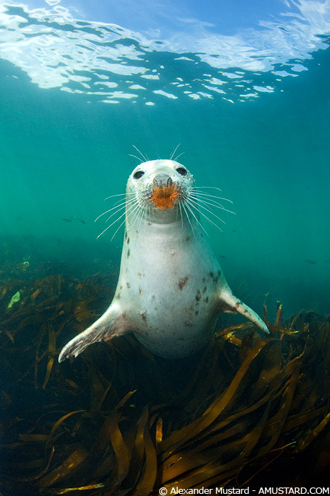
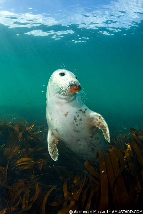
I got a bit more strobe on the seal and I think that this helps. For me these encounters were particularly special because of the sunny weather and calm surface conditions (well relatively, on both counts). Although there is possible too much strobe in the second image - although I like this more characterful/interesting pose more.
Alex
Alex's shots illustrate a second point when it comes to shooting grey seals. It's a matter of taste, but I think the ones with the lighter coloration are an absolute gift to the photographer, in that they have an inherent, 'nature's contrast'. You can always get lovely shots with the darker ones, but they need a bit more strobe.
That said, I'm interested to see that Alex now has his seals wearing lipstick!
I really like the colour one, as Alex said, the blue sky is rare, (at least it has been for the last few months  ) I would like to see a bit more colour balance on the seal (more strobe) but 2 mins in photoshop sorts that out
 It is a good shot none the less.
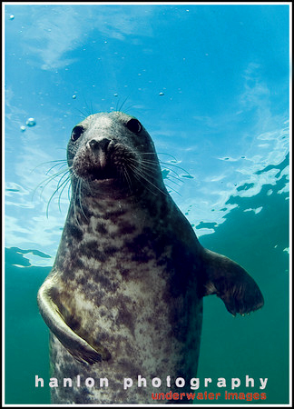

Terms of Use Privacy Policy Guidelines We have placed cookies on your device to help make this website better. You can adjust your cookie settings, otherwise we'll assume you're okay to continue.

A worldwide community for underwater imaging.
